Food Discussion App Case Study
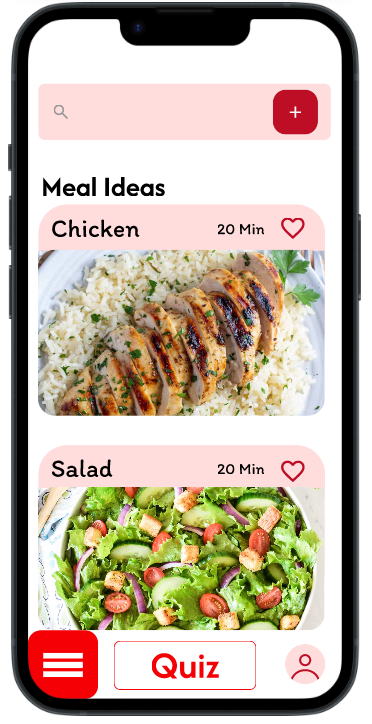
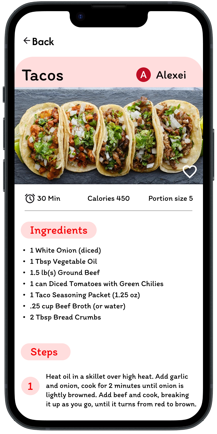
Designed a mobile app concept that helps users decide what to eat based on their preferences. I focused on creating a simple, engaging interface and an easy-to-use quiz experience.
Problem Statment
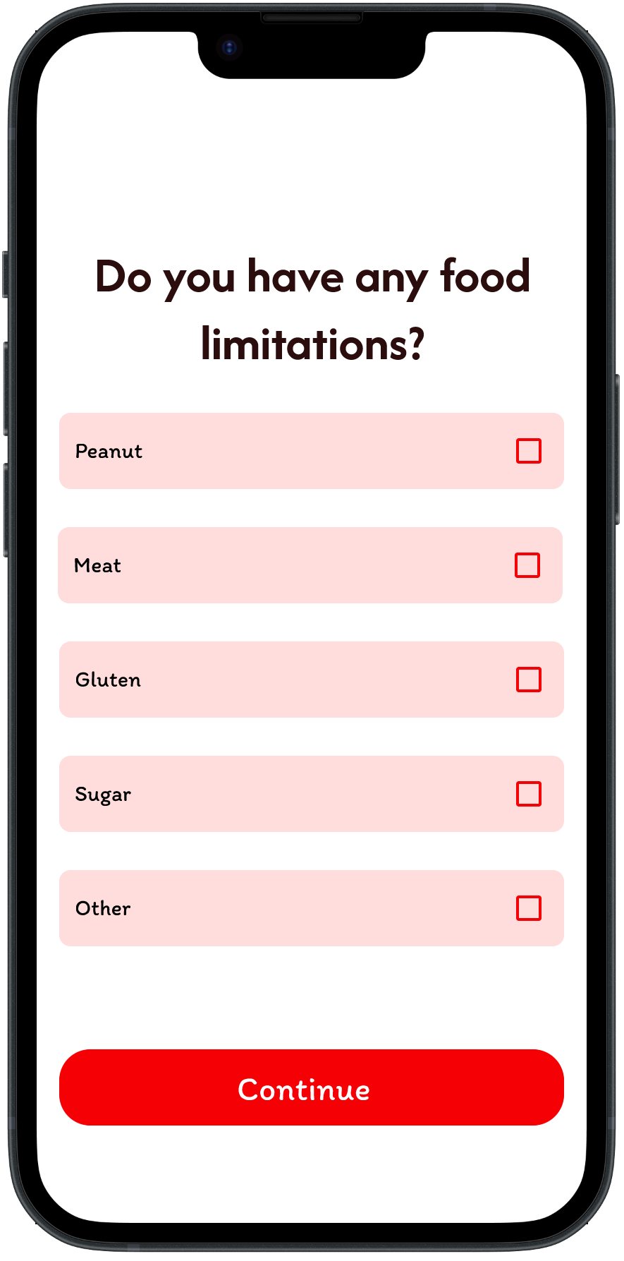
Deciding what to eat can be difficult, especially after a long day when users don’t want to spend time searching through endless recipes. Even when people have ingredients at home, they may not know what to make. This app aims to simplify that decision by combining factors like mood, cravings, and available ingredients to provide more personalized meal suggestions.
Goals
- Help users quickly decide what to eat without having to search through countless options
- Use factors such as mood, cravings, and available ingredients to recommend meals that fit the user’s needs
- Make choosing a meal feel quick, easy, and less stressful through a straightforward interface.
User Interviews
Understanding the Problem
To better understand how people decide what to eat, I interviewed two participants about their eating habits, frustrations, and the tools they currently use for meal inspiration. Both participants considered time an important factor when choosing what to eat, while also wanting easier ways to come up with meals using ingredients they already have.
Key Insights
01 — Deciding what to eat takes time
One participant said they often wait until they’re very hungry before deciding what to eat and find the decision-making process itself difficult.
02 — Users want to use what they already have
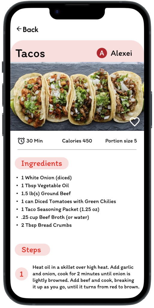
Both participants mentioned wanting a way to create meals using ingredients already available at home.
03 — Inspiration isn’t always enough
One participant currently uses Pinterest for food inspiration but found that it doesn’t provide specific instructions and that information found online isn’t always reliable.
04 — Users want the app to make the decision easier
Rather than giving users another list of choices, participants wanted a tool that could recommend what they should cook based on their answers and available time.
Turning Insights Into Design
| What I Heard | Design Response |
|---|---|
| “I don’t know what to eat.” | Created a questionnaire to narrow down choices. |
| Time is an important factor. | Include time/preparation preferences in recommendations. |
| Users want to use ingredients they already have. | Incorporate available ingredients into meal suggestions. |
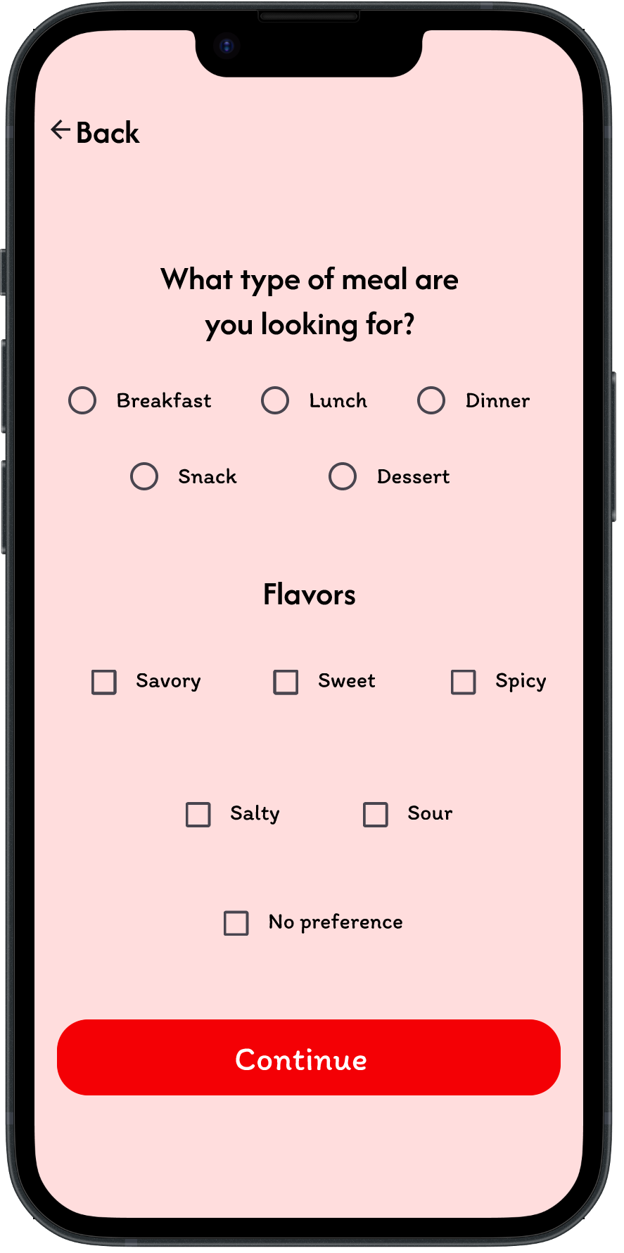
| Users want someone/something to suggest a meal. | Provide recommendations based on questionnaire answers. |
Low Fidelity Prototype
Usability Testing
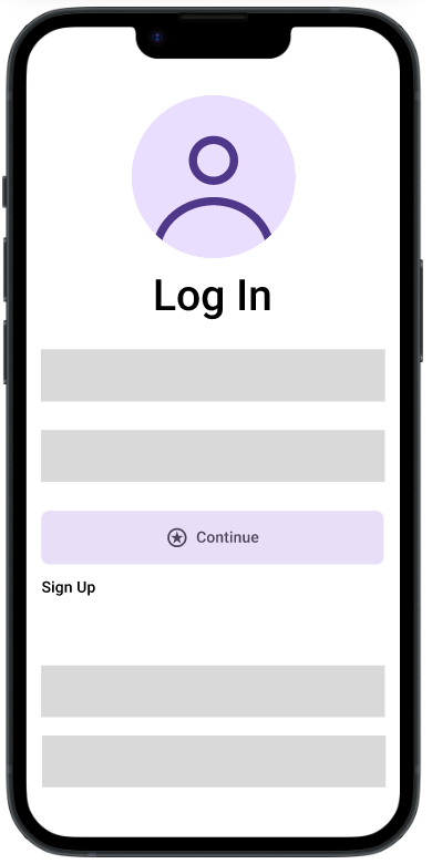
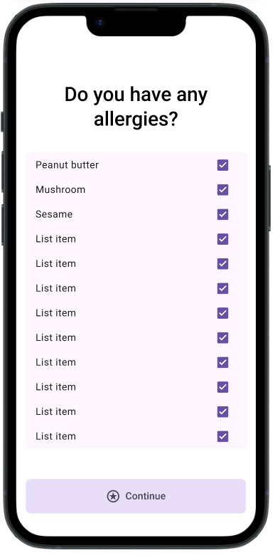
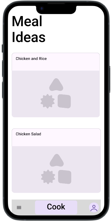
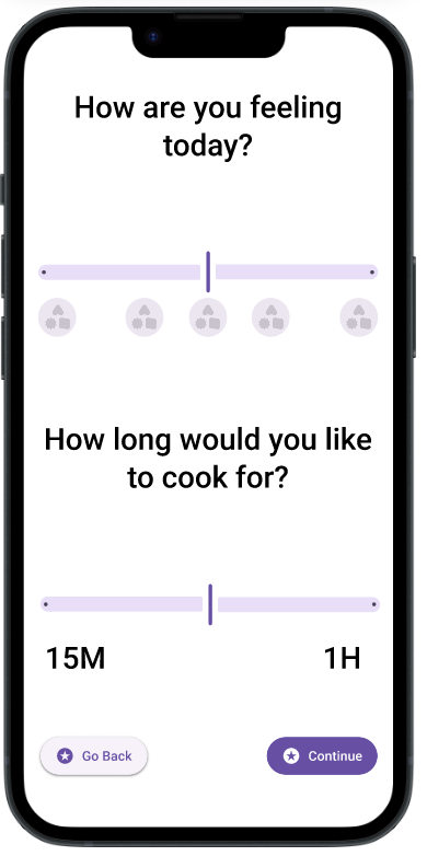
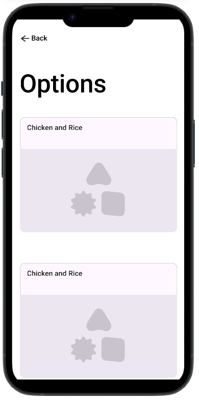
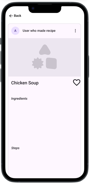
I tested the low-fidelity prototype to see whether users could understand the meal-selection process and whether the concept felt useful in a real-world situation. Overall, users responded positively to the concept and visual direction, but testing revealed several areas where the interface needed clearer communication.
1. Visual Design
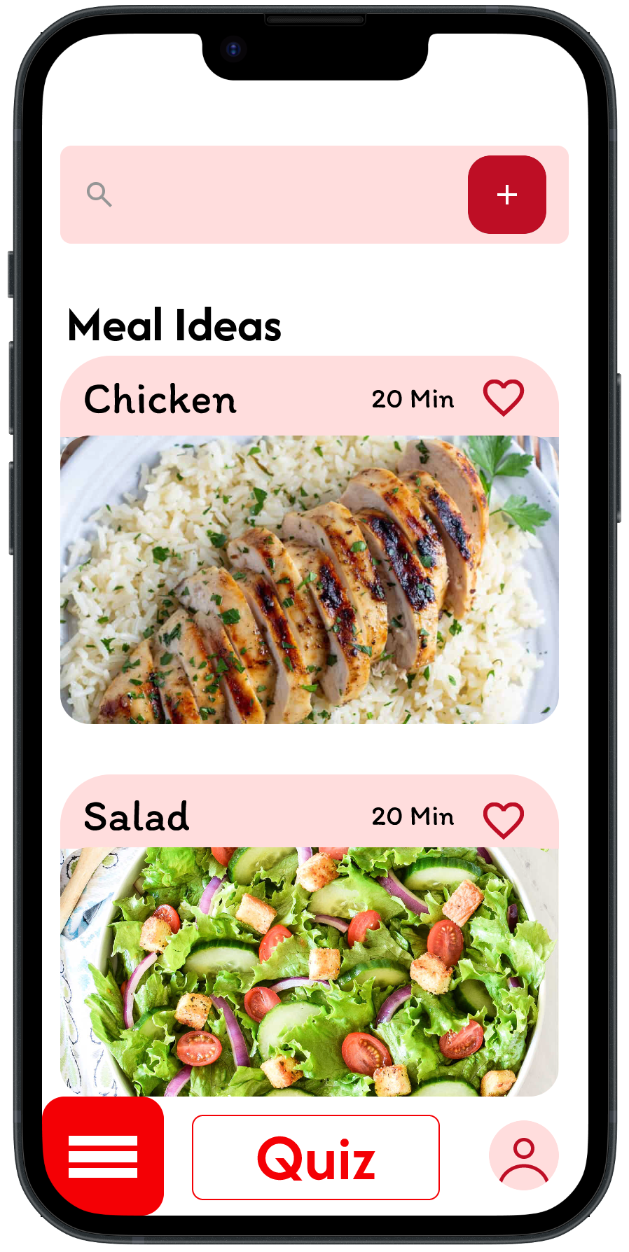
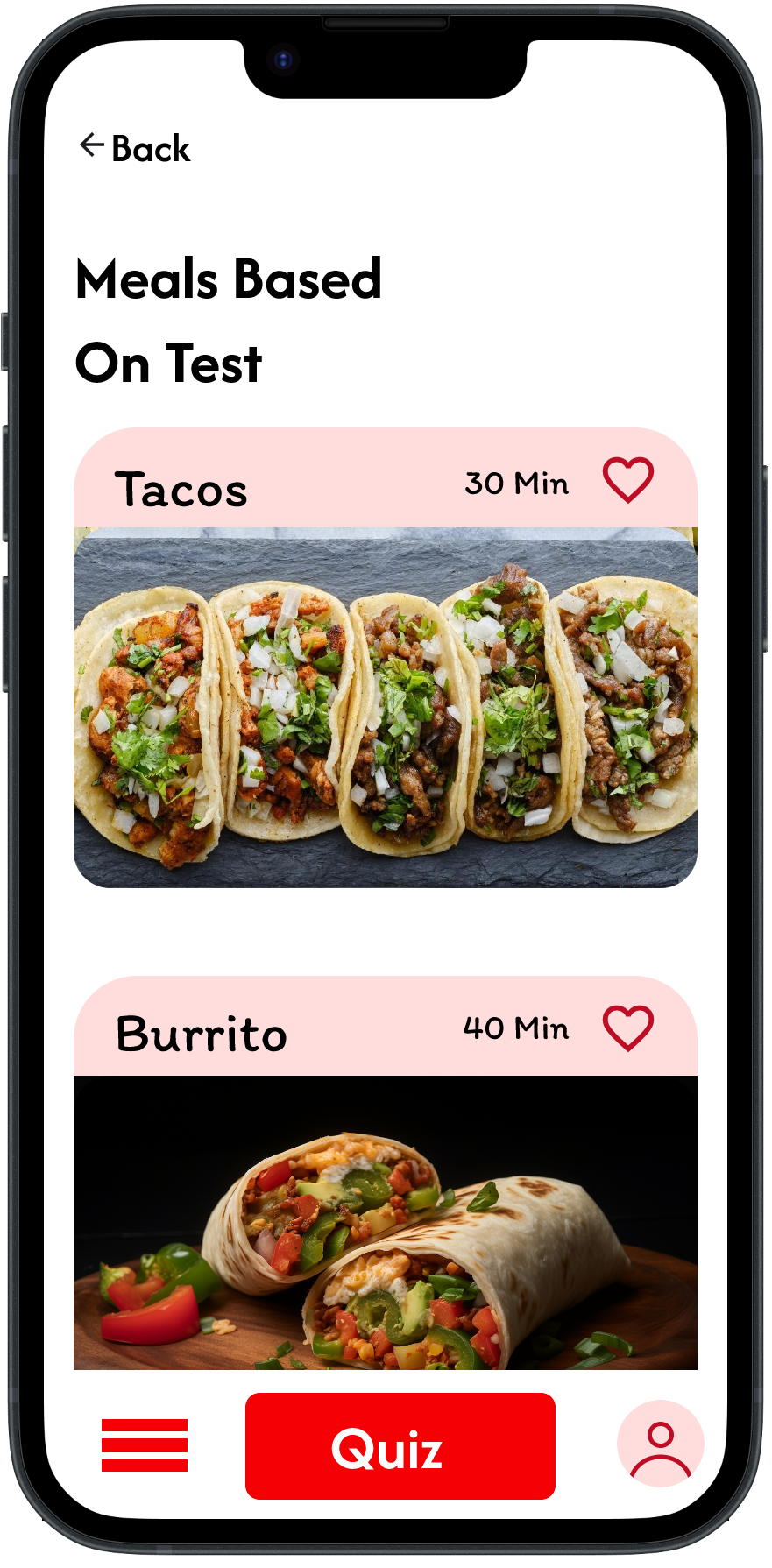
Users liked the images and color scheme.
2. Meal Suggestions
Users found the recommendations useful and surprising.
3. Navigation & Labels
The “Cook” button and labels such as “Comforting” were unclear.
4. Time Selection
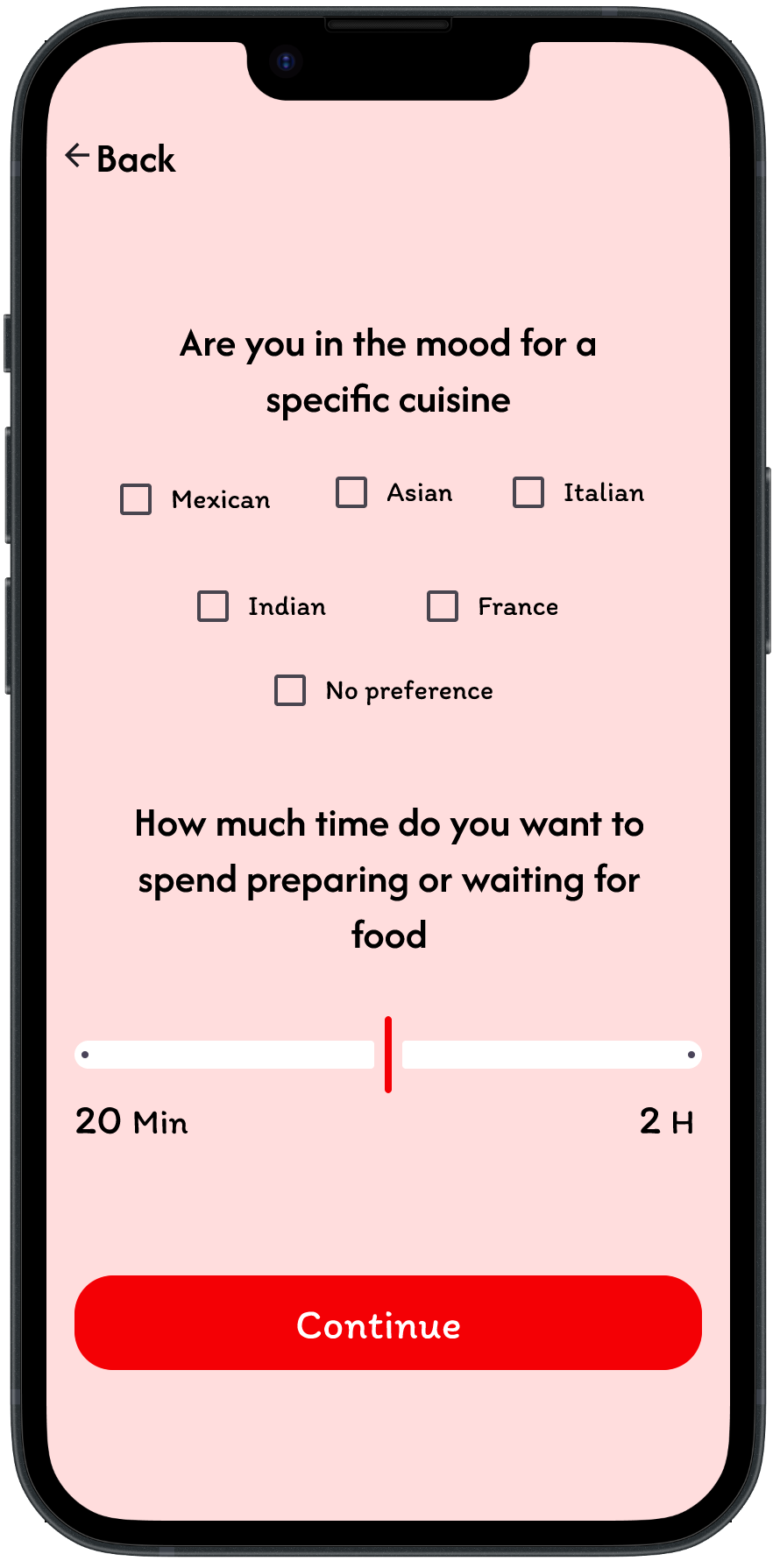
The “m” abbreviation caused confusion when selecting cooking time.
What I changed
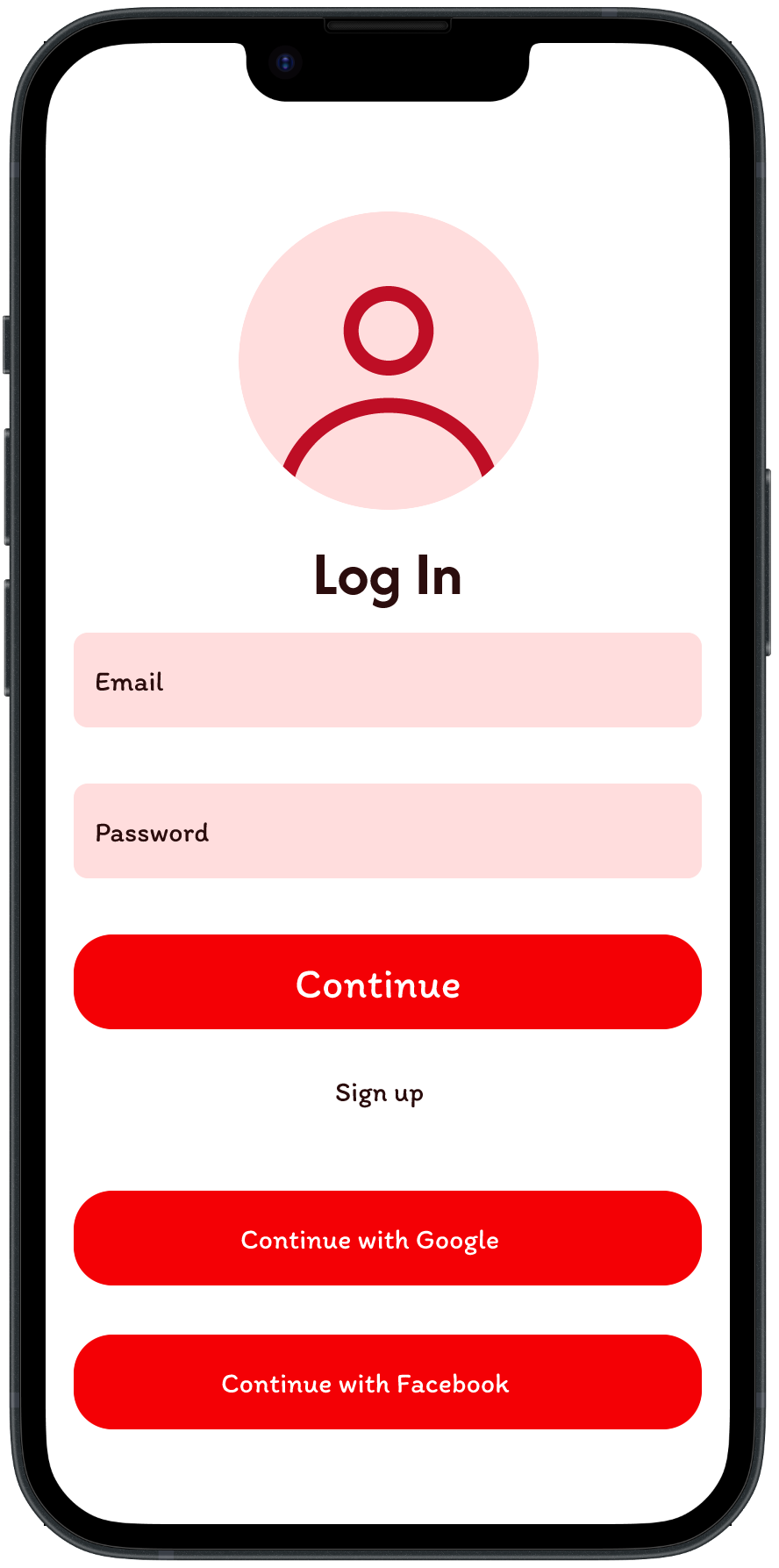
The testing showed me that even when the overall concept is easy to understand, small interface details can create confusion. I used this feedback to refine the wording, controls, and meal-selection experience in the next version.
Final Prototyping
Final Takeaways
- Made meal decisions faster and easier through personalized suggestions.
- Learned that small interface details can cause major confusion.
- Used usability testing to identify problems and improve the design.
- Created a solution focused on reducing decision fatigue.
Conclusion
This project explored how a meal-decision app could make choosing what to eat easier and less time-consuming. Through user interviews and prototype testing, I found that users value quick meal suggestions, especially when they can consider factors like time and the ingredients they already have. Testing the low-fidelity prototype showed that users found the overall concept helpful, but some buttons, labels, and controls needed to be clearer. I used this feedback to refine the experience and create a more intuitive final design.